
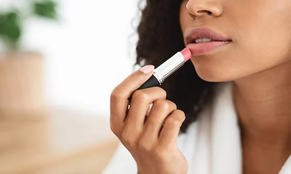
Have you ever bought a lipstick because it looked perfect on someone else, only to find that the same shade seemed completely different on you?
It doesn’t necessarily mean you chose a bad product. Color interacts with the complexion, eyes, hair and overall contrast of the person wearing it. A soft rose that looks fresh and natural on one person may appear dull on another, while a dramatic berry shade can either overwhelm the face or bring it to life.
Understanding a few basic principles of color harmony can make choosing makeup much easier-and may prevent quite a few products from being abandoned at the back of the makeup drawer.
Start With Skin Depth and Undertone
Skin depth and undertone are related, but they are not the same thing.
Skin depth describes how light or deep the complexion appears. Undertone refers to the warmer, cooler or more neutral characteristics underneath the surface appearance of the skin.
This distinction is important because two people with a similar skin depth can look very different in the same lipstick or blush.
It is also worth avoiding rigid rules such as assuming that fair skin is always cool or deeper skin is always warm. Natural coloring is considerably more varied than that.
A broader approach known as color analysis looks at several characteristics together, including whether colors appear warmer or cooler, lighter or deeper, and softer or brighter against the face.
Instead of trying to fit yourself into a category immediately, you can use those same principles when comparing makeup shades.
Compare Warm and Cool Colors
One of the easiest experiments is comparing two similar products with different color temperatures.
For example, try:
- peach blush versus rose blush;
- coral lipstick versus berry lipstick;
- bronze eyeshadow versus cool taupe;
- tomato red lipstick versus blue-red lipstick.
Apply the shades in the same lighting and look at your entire face rather than concentrating only on the makeup itself.
Does one shade make the complexion appear more even? Do your eyes become more noticeable? Does another shade seem to sit on top of your face rather than blending with your natural coloring?
The goal isn’t to decide that warm or cool colors are universally better. It is simply to notice which direction feels more harmonious on you.
Don’t Forget About Color Depth
Temperature receives a lot of attention in beauty advice, but the depth of a color can be equally important.
Someone whose coloring is naturally light may find that very dark lipstick dominates the face even if the undertone is technically flattering. Someone with deeper or higher-contrast coloring may find that extremely pale shades disappear or create an ashy effect.
Think of makeup colors on a spectrum from light to deep.
A lighter makeup palette might include soft pinks, peaches, champagne, light taupes and gentle berry shades.
A deeper palette might contain burgundy, plum, espresso, rich bronze, brick red and deeper berry tones.
You don’t have to limit yourself exclusively to one end of the spectrum. Instead, notice how much depth your features can comfortably carry.
Bright Versus Muted Makeup Matters Too
Another useful consideration is intensity.
Some colors are clear and saturated. Think vivid fuchsia, bright coral or jewel-toned eyeshadow.
Others are softened with gray, brown or beige. Dusty rose, muted mauve, soft terracotta and smoky taupe fall into this category.
A bright shade can look wonderfully fresh on someone whose natural coloring handles strong saturation. On another person, exactly the same shade may seem to arrive in the room before they do.
Likewise, muted colors can look sophisticated and effortless on some complexions but slightly dull on others.
This is why simply knowing whether you have a warm or cool undertone doesn’t always solve the makeup puzzle.
Finding a Better Blush
Blush is a particularly useful product for experimenting because it sits directly beside the natural coloring of the skin.
Instead of buying several products at once, compare shades from different color families.
For warmer options, consider peach, apricot, coral and warm rose.
For cooler options, try pink, raspberry, mauve and cool rose.
Then consider intensity. If strong blush easily overwhelms your features, look for softer or more muted versions of those colors. If subtle blush tends to disappear, slightly clearer or richer shades may work better.
The best blush usually looks integrated with the complexion rather than obviously sitting on top of it.
Choosing Lipstick With More Confidence
Lipstick is where understanding color harmony can save considerable trial and error.
Start by identifying a color family you already enjoy-red, pink, nude, berry or coral-and compare variations within that family.
A red lipstick, for example, can lean orange, neutral, blue, brown, bright or deep. Two products labelled simply “red” can therefore create completely different effects.
Instead of asking, “Can I wear red?” a more useful question is, “Which type of red works best for me?”
The same principle applies to nude lipstick. A nude shade shouldn’t necessarily match your skin exactly. Look for enough contrast to keep the lips defined while choosing a temperature and depth that work with the rest of your coloring.
Use Eyeshadow to Repeat Your Natural Contrast
Eyeshadow does not always need to match your eye color. In many cases, choosing the right depth and intensity is more useful.
Someone with softer overall coloring might prefer taupe, muted brown, dusty mauve or gentle bronze.
Higher-contrast coloring can often support stronger espresso, charcoal, jewel tones or clearer metallic shades.
You can also use contrast deliberately. A complementary eyeshadow color can make the eyes stand out, while a related shade can create a softer and more blended result.
Neither approach is inherently better-it depends on the effect you want.
Test Makeup in Consistent Lighting
Lighting can completely change the appearance of color.
Warm bathroom bulbs can make a cool lipstick appear more neutral. Bright store lighting can make colors look different from the way they appear outdoors.
When comparing makeup shades, try to use the same lighting each time. Natural indirect daylight is particularly useful.
It can also help to take photographs without beauty filters or automatic color adjustments when possible. This makes it easier to compare several looks rather than relying on memory.
Treat Color Rules as a Starting Point
Personal color systems can be helpful, but makeup should not turn into a collection of restrictions.
If you love a lipstick that technically falls outside your most harmonious range, wear it.
Color knowledge is most useful as a shopping filter. It helps explain why certain shades repeatedly work, gives you a more focused place to start at the makeup counter and makes it easier to build a collection in which products work together.
From there, personal taste should take over.
Build Your Own Makeup Color Palette
Once you begin noticing patterns, write down the shades that consistently work.
You may discover that your most reliable palette contains:
- two everyday lip colors;
- one stronger evening lipstick;
- one or two blush families;
- three or four neutral eyeshadows;
- one metallic shade;
- a dependable eyeliner color.
That small amount of information can make future shopping considerably easier.
The objective isn’t to own every flattering shade. It’s to understand the characteristics that make a color work so that you can recognize similar options when you see them.
When you stop choosing makeup solely because a shade looks attractive in the packaging-and start paying attention to how temperature, depth and intensity interact with your own coloring-you can build a collection that feels far more intentional.
